
This Seashell Summer House is a Showcase of Colour Mastery
Through confident use of colours, the Design Avenue’s Karen Fadel wields shifting palettes to transform these open spaces and imbue them with a definite sense of place.

Colour theory has a lot to say about how you should put your home together, but in the hands of an experienced designer, colour becomes less of a guide and more of a toybox to play with. Take this seashell summer house, for instance. Designed by Karen Fadel - one of the four managing partners at Design Avenue who prefers to take a hands-on approach to out-of-the-box residential projects - the entrance to this summer house starts with a shock of red, before going through lavender to smoothly transition between different shades of blue.
-546167bd-7e5a-4580-a419-c93100fd9539.jpeg) “It’s not just about combining colours,” Fadel tells #SceneHome. “With each providing certain energies, they need to be picked with the right balance in mind. I always ask our clients about the impressions they want their home to give.”
“It’s not just about combining colours,” Fadel tells #SceneHome. “With each providing certain energies, they need to be picked with the right balance in mind. I always ask our clients about the impressions they want their home to give.”
In this case, the clients wanted a home that was “stylish and artistic, yet comforting and down to earth, a bit of a party home but definitely a statement.” Fadel sought to meet these expectations by mixing decorations that are each creative and soothing, boldly pairing hot and cold in spaces that are simultaneously open yet, in their own way, closed.
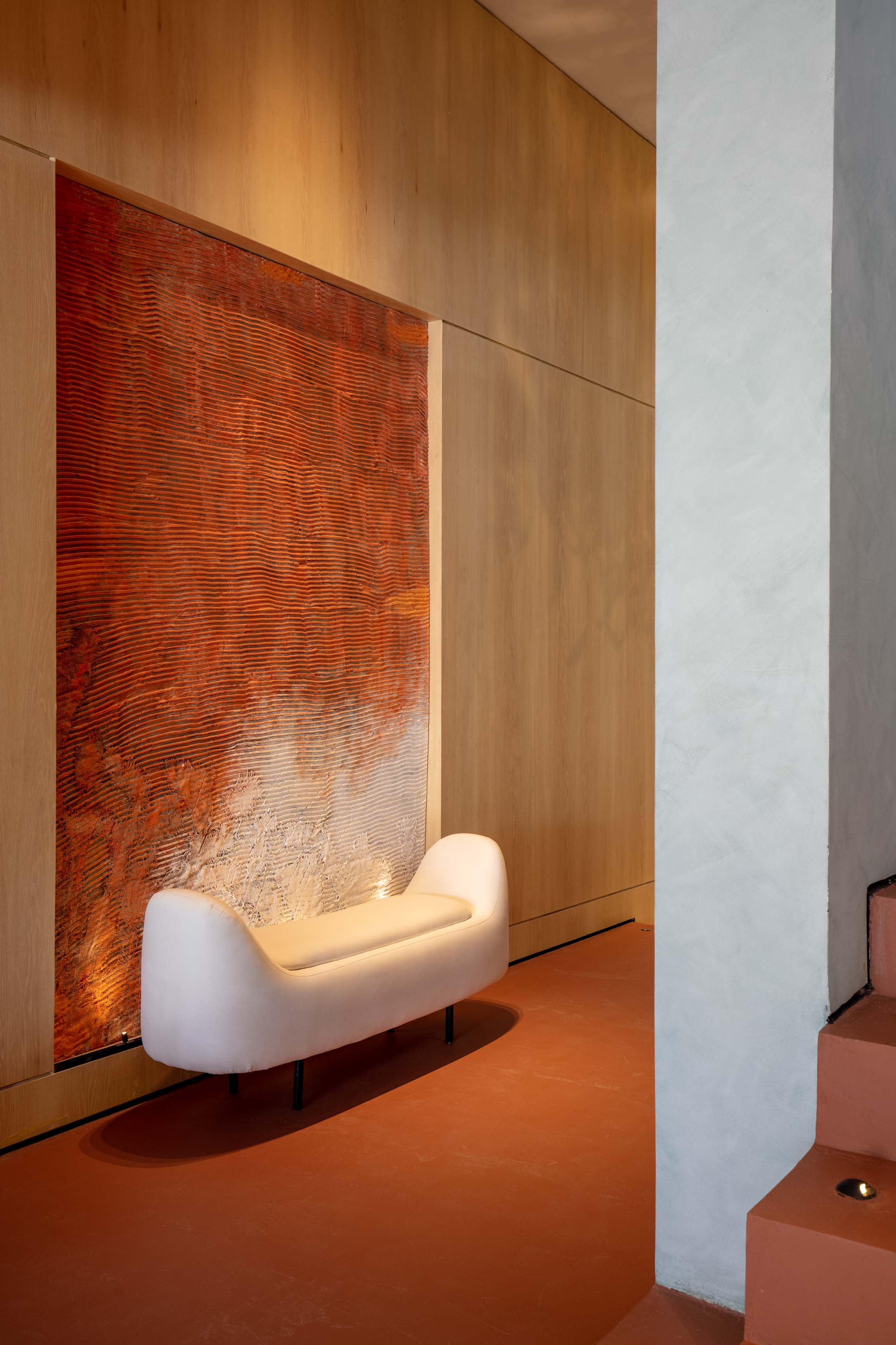 In the foyer, brick red with imperfect finish covers the floor while wooden cladding on the wall brightens the palette and draws a clear path to the rest of the abode. Striving for form, Fadel placed a white sofa in front of rugged artwork flushed into the wood. “It was all sunny, fair and neat so I wanted to add some rough texture,” Fadel says. She applied these subtle shifts in textures throughout the home, like a rattan carpet in the living room or the rough column separating the dining table from the open kitchen.
-0eb62cfa-8e49-4f7b-b14c-71142c2e0d02.jpeg) To Fadel, stairs aren’t just means of ascension, they are centrepieces. “I like to turn them into a feature that grabs your attention.” Trees were placed at different focal points to guide your way up, and to be viewable from any point in the house. “I wanted something striking and dynamic that keeps you interested in going up,” Fadel adds. The theme is complemented by a massive painting of angelic figures swaying in joy and colour. And really, when you’re on the shores of the Mediterranean, time does pass by as though you’re in Eden.
To Fadel, stairs aren’t just means of ascension, they are centrepieces. “I like to turn them into a feature that grabs your attention.” Trees were placed at different focal points to guide your way up, and to be viewable from any point in the house. “I wanted something striking and dynamic that keeps you interested in going up,” Fadel adds. The theme is complemented by a massive painting of angelic figures swaying in joy and colour. And really, when you’re on the shores of the Mediterranean, time does pass by as though you’re in Eden.
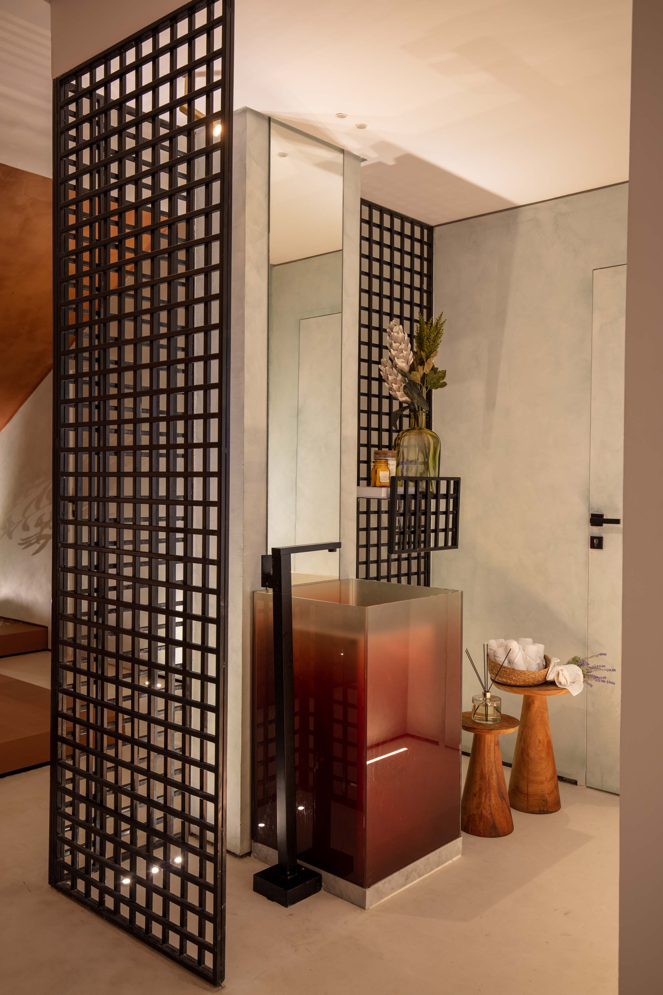 Beyond the foyer, you’ll see the powder room and its statement sink, with gradient glass that goes from red to transparent. “I loved this element, it created a zone without actually closing it up,” Fadel says. She used the same element on the main cladded wall, this time to showcase blue boulder sculptures, a segue to the ocean of blues in the living room. But before completely shifting the palette, the designer added a touch of black in the sleek dining set up which yet again has a sculpted rock breaking through its end.
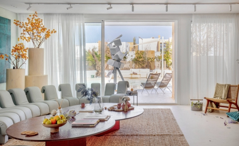
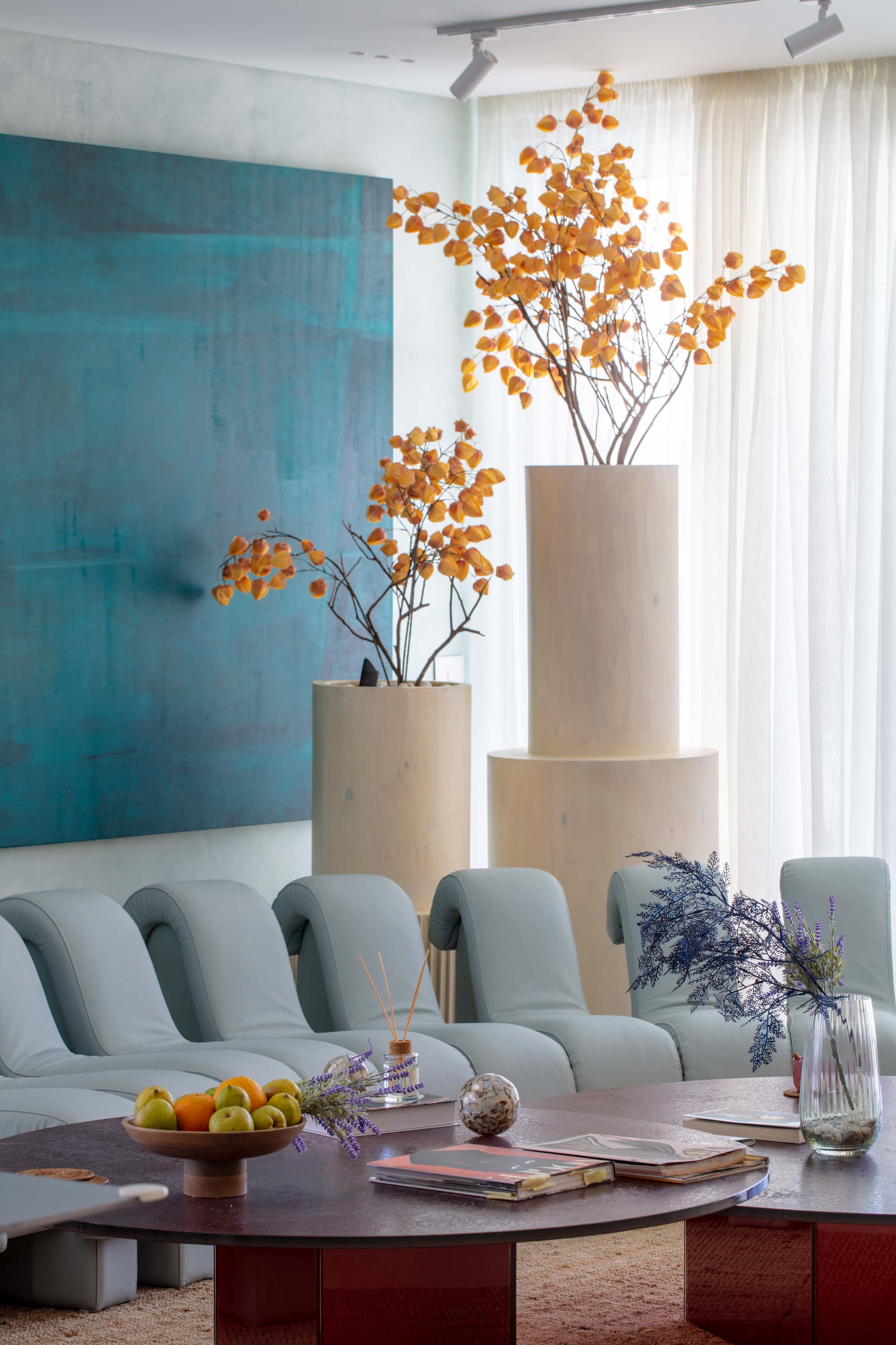 “There’s intention in the contrast, even if it’s between similar shades,” Fadel emphasises. Atop a rattan rug, a baby blue sofa that caught Fadel’s eye with its delicate forms sets the tone of the space as a faded green covers the wall, save for a portion occupied by a teal painting, while yellow plants provide cheerfulness in big-scaled wooden pots.
“It’s a play of different layers and styles, the dining table was intense so the artwork had to be simple to maintain the calm,” Fadel continues. “It’s like picking out an outfit, each element on its own could be normal but when put together, they have a shared spirit. Sort of like a winning combo!”
-c6d724f8-f780-4772-907c-ade2f44726ed.jpeg) Outside, the pool is separated from the jacuzzi by glass partitions and centred by a constellation of metal sculptures that are complemented by a gigantic figure customised by Artiora, with a huge box for a head while lifting a huge peace sign. “The bar was linked to the dining table by pebbles on the ground and customised terrazzo,” Fadel adds. “Not everything needs to have contrast. Sometimes things complement each other when their transitions are calm.”
Outside, the pool is separated from the jacuzzi by glass partitions and centred by a constellation of metal sculptures that are complemented by a gigantic figure customised by Artiora, with a huge box for a head while lifting a huge peace sign. “The bar was linked to the dining table by pebbles on the ground and customised terrazzo,” Fadel adds. “Not everything needs to have contrast. Sometimes things complement each other when their transitions are calm.”
-2d82a4e6-de71-4dda-9724-9c99dfe61909.jpeg) Fadel planned out each tree in the landscape, from olive to lavender, to create a smooth environment with plenty to look at and enjoy as you sit on light blue chairs that match the pool. Which, incidentally, maintains its cerulean hue thanks to another subtle trick: instead of using blue mosaics for the pool, Fadel went with white, and let the water and the sky naturally figure out the appropriate shade of blue. Sometimes a mastery of colours is letting it all settle down naturally, and Fadel expresses it with aplomb.
Fadel planned out each tree in the landscape, from olive to lavender, to create a smooth environment with plenty to look at and enjoy as you sit on light blue chairs that match the pool. Which, incidentally, maintains its cerulean hue thanks to another subtle trick: instead of using blue mosaics for the pool, Fadel went with white, and let the water and the sky naturally figure out the appropriate shade of blue. Sometimes a mastery of colours is letting it all settle down naturally, and Fadel expresses it with aplomb.
- Previous Article Dr.Sisilove or How (Not) To Diffuse A Bomb
- Next Article Central Bank of Egypt Raises Interest Rates by One Percent
Related Articles
Trending This Week